
How to Use the Box Plot Calculator
This box plot calculator helps you create a box-and-whisker plot for a single or multiple groups on the same scale. To create a box plot for a single group:
- Select Single Group.
- Choose Raw Data or Five-Number Summary from the Input Type menu.
- Enter the required values.
- Select a quartile method when using raw data.
- Click Calculate.
The calculator will generate a single box plot along with associated statistics such as the minimum, Q1, median, Q3, maximum, interquartile range, whisker endpoints, and potential outliers. You can also download the resulting box plot in PNG format.
However, to create a box plot for multiple groups using the calculator:
- Select Multiple Groups.
- Enter a name and raw data values for each group.
- Use Add Another Group when you need more data groups.
- Choose the quartile calculation method.
- Click Calculate.
The box plot maker will display all groups on the same scale so you can compare their medians, spreads, whiskers, and potential outliers.
Note. When working with raw data, the calculator allows you to enter values separated by commas, spaces, tabs, or line breaks. You can also paste values directly from Excel, Google Sheets, or text documents.
What Is a Box Plot?
A box plot, also called a box-and-whisker plot, is a graph that summarizes the distribution of numerical data using quartiles.
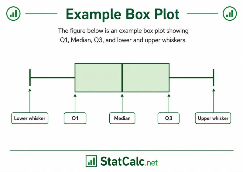
The box extends from the first quartile, Q1, to the third quartile, Q3. A line inside the box marks the median (also known as the second quartile). Lines called whiskers extend beyond the box to show the smallest and largest values that are not classified as potential outliers.
The figure below is an example box-and-whisker plot showing Q1, Median, Q3, and lower and upper whiskers.
A standard box plot is mainly used to examine:
- the center of the data,
- the spread of the middle 50%,
- the overall non-outlier range,
- possible skewness,
- and potential outliers.
However, a box plot of multiple groups placed side by side can be used to compare distributions across groups.
As you can see, a box plot provides a visual representation of the five-number summary. For more details about how to find the five-number summary manually and using the calculator, use the five-number summary calculator.
How to Read a Box Plot
A box plot (or box-and-whisker plot) shows a set of data using five key numbers: the minimum, the median, and the maximum, along with the upper and lower quartiles. It splits the data into four equal parts, with each section holding 25% of the information
A box plot contains several important components. These include:
- Minimum. This is the smallest value in the dataset.
- First Quartile. The first quartile, Q1, marks the lower edge of the box. Approximately 25% of the ordered data lie at or below this point.
- Median. The median, also called Q2, is represented by the line inside the box. It divides the ordered data into a lower half and an upper half.
- Third Quartile. The third quartile, Q3, marks the upper edge of the box. Approximately 75% of the ordered values lie at or below this point.
- Interquartile Range (IQR). The interquartile range measures the width of the box. The larger the box, the higher the IQR.
- Whiskers. The whiskers extend from the box to the smallest and largest observations that remain within the lower and upper outlier fences.
- Potential Outliers. Values outside the whiskers are plotted as separate points. The calculator identifies them using the 1.5 × IQR rule. As such, these values should be treated as potential outliers rather than automatically assumed to be mistakes.
How to Create a Box Plot Using the Calculator
The box plot calculator can create a box-and-whisker plot for one dataset or compare several groups on the same scale. The following examples show how to enter the data, generate the graph, and report the result.
Example 1: Create a Box Plot from Raw Data
A teacher records the time, in minutes, taken by 10 students to complete an assignment:
14, 16, 18, 19, 21, 22, 23, 25, 27, 41
Create a box plot and identify any potential outliers.
Solution
To make the box plot using the calculator, follow these steps:
- Select Single Group.
- Choose Raw Data from the Input Type menu.
- Copy and paste the values: 14, 16, 18, 19, 21, 22, 23, 25, 27, 41 into the calculator input field
- Select Median of Halves (Tukey) as the quartile method.
- Click Calculate.
The calculator creates the following box plot.
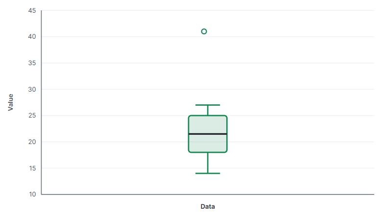
The graph displays a box from 18 to 25, with the median at 21.5. The value 41 appears as a separate point because it is identified as a potential outlier.
Example 2: Create a Box Plot from a Five-Number Summary
A researcher summarizes the weekly study hours of a sample of college students as follows:
- Minimum = 8
- Q1 = 15
- Median = 21
- Q3 = 29
- Maximum = 37
Create a box plot from the given summary.
Solution
To make a box plot from the five-number summary data using the calculator:
- Select Single Group.
- Choose Five-Number Summary from the Input Type menu.
- Enter:
- Minimum: 8
- Q1: 15
- Median: 21
- Q3: 29
- Maximum: 37
- Click Calculate.
The calculator will use the five-number summary and create a box plot shown below.
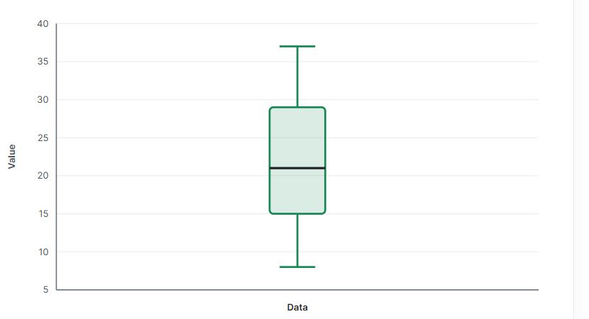
The box extends from 15 to 29, while the median line appears at 21. Because only a five-number summary was entered, the calculator cannot identify individual potential outliers.
Example 3: Compare Multiple Groups Using Side-by-Side Box Plots
A school administrator wants to compare mathematics test scores from three classes. The data are:
- Class A: 52, 55, 58, 61, 63, 65, 68, 70, 72
- Class B: 48, 50, 54, 57, 59, 60, 62, 64, 66
- Class C: 55, 57, 60, 62, 64, 67, 69, 71, 92
Create side-by-side box plots and compare the score distributions.
Solution
To create a side-by-side box plot using the calculator:
- Select the Multiple Groups Option
- Enter Class A as the first group name and paste its scores.
- Enter Class B as the second group name and paste its scores.
- Add a third group named Class C and enter its scores.
- Select Median of Halves (Tukey) as the quartile method.
- Click Calculate.
The calculator will instantly display a side-by-side box plot shown below.
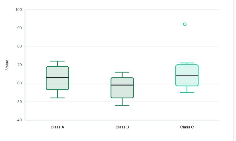
The side-by-side box plots show that:
- Class C has the highest median score at 64.
- Class A has a median of 63.
- Class B has the lowest median score at 59.
- Class A has the largest IQR, indicating the greatest spread in the middle 50% of scores.
- Class C has a potential high outlier at 92.
- Class B generally has lower scores than Classes A and C.
Because the three box plots use the same scale, their centers, spreads, whiskers, and potential outliers can be compared directly.
Why Can Different Box Plot Makers Give Different Quartiles?
There is more than one accepted method for calculating quartiles. As a result, two calculators may produce slightly different Q1 and Q3 values for the same dataset.
With our box plot maker, you can either use the median of halves or the inclusive interpolation method. The median of halves method divides the ordered data into a lower half and an upper half. Q1 is the median of the lower half, while Q3 is the median of the upper half. On the other hand, the inclusive interpolation method calculates quartiles using interpolation and is compatible with Excel’s QUARTILE.INC approach.
Tip. When comparing results with a textbook, spreadsheet, or statistical package, select the same quartile method used by that source.
Frequently Asked Questions
This calculator is also called the box plot maker. It creates a box-and-whisker plot from raw data or a five-number summary. It also calculates quartiles, IQR, whisker endpoints, and potential outliers when raw data are entered.
Yes. “Box plot” and “box-and-whisker plot” refer to the same type of statistical graph.
Yes. The calculator also helps you create a side-by-side box plot. To do that, select Multiple Groups and enter each dataset as a separate raw-data group.
Yes. This box plot maker also allows you to create a single box plot from the five-number summary. To create the plot, select Single Group -> Five-Number Summary and enter the minimum, Q1, median, Q3, and maximum.
When the data contain potential outliers, the whiskers stop at the smallest and largest observations within the 1.5 × IQR fences. Values beyond the whiskers are plotted separately.
The calculator uses the 1.5 × IQR rule. Values below Q1 − 1.5 × IQR or above Q3 + 1.5 × IQR are marked as potential outliers.
Yes. After generating the chart, use the Download PNG button to save the box plot as an image.
