
How to Use the Scatter Plot Maker
This scatter plot maker serves as a calculator to help you create a simple scatter plot from two sets of paired numerical data. It also allows you to optionally add a line of best fit, its equation, and the coefficient of determination, R2.
To create a scatter plot using this tool:
- Enter the X values in the first input box.
- Enter the corresponding Y values in the second input box.
- Add a chart title and axis labels if needed.
- Select Show line of best fit only when you want a fitted regression line. If the fitted line is selected, you can also choose to display its equation and the coefficient of determination (R2).
- Click Calculate
This calculator will instantly return a scatter plot of X and Y values with the correct chart title and axis labels. Want to use the graph anywhere? The calculator also allows you to download the scatter plot as a .png file.
Note. The data input fields in this scatter plot maker allow you to paste values directly from Excel, Google Sheets, or text documents. For manual data entry, you can either separate the values using commas, spaces, line breaks, or tabs.
What Is a Scatter Plot?
A scatter plot is a graph used to display the relationship between two numerical variables. Each observation is represented by a point with an X coordinate and a Y coordinate. The X variable is shown on the horizontal axis, while the Y variable is shown on the vertical axis.
How to Make a Scatter Plot
To create a scatter plot by hand, follow these steps:
- Identify the Y variable. This is mainly the response/dependent variable.
- Identify the X variable. This is the independent/explanatory variable
- Pair the observations by ensuring that every X value has a corresponding Y value.
- Plot each coordinate pair on a graph. Do not connect the points.
- Label the axes according to the names of your variables
- Add a clear chart title to make the graph easier to understand.
Example 1: Creating a Scatter Plot using the Calculator
A teacher wants to examine the relationship between hours studied and test scores for eight students.
| Hours Studied | Test Score |
|---|---|
| 1 | 52 |
| 2 | 57 |
| 3 | 63 |
| 4 | 68 |
| 5 | 72 |
| 6 | 79 |
| 7 | 83 |
| 8 | 88 |
Create an appropriate graph for the data.
Solution
To create the scatter plot using the scatter plot maker, follow these steps:
- Enter the hours studied values in the X variable input field. You can copy and paste these values: 1, 2, 3, 4, 5, 6, 7, 8
- Enter Test Score in the Y variable input field. You should copy and paste these values: 52, 57, 63, 68, 72, 79, 83, 88
- Enter the chart title as ” Scatter Plot of Study Hours vs. Test Scores“
- Enter “Hours Studied” in the X-Axis Label input field
- Enter “Test Score” in the Y-Axis Label input field
- Click Calculate
The calculator will instantly return the scatter plot below.
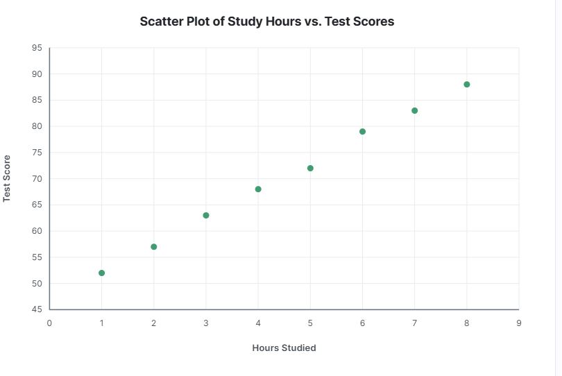
Want to see the simple linear regression equation? You only need to check the “Show line of best fit” and “Show equation” boxes.
How to Read a Scatter Plot
A scatter plot helps you assess the direction and strength of the relationship between two numerical variables.
Here is how to determine the direction of a linear relationship using a scatter plot:
- If the points generally rise from left to right, there is a positive linear relationship between the two variables. This suggests that as X increases, Y tends to increase.
- If the points generally fall from left to right, then there is a negative linear relationship between the two variables. This implies that Y decreases as X values increase.
- However, if the points do not show a consistent upward or downward trend, we say that there is no linear relationship between the two variables.
Alternatively, you can use a scatter plot to gain an idea of the strength of the linear relationship. Here’s how it works:
- If the points are clustered closely around a clear pattern or an imaginary straight line, there is a strong linear relationship between the two variables
- If the points follow a noticeable pattern but show more spread, we describe the linear relationship as moderate.
- However, if the points are widely scattered, with only a slight overall pattern, we say that there is a weak linear relationship between the two variables.
Tip: You can also use scatter plots to identify unusual observations. These are mainly the points that lie far away from the general pattern of the data in a scatter plot.
When Should You Add a Line of Best Fit?
A line of best fit is useful when:
- The scatter plot shows an approximately linear pattern,
- You want to summarize the direction of the relationship,
- You need to make predictions using a linear regression equation,
- The question specifically asks for a trend line or regression line.
Note. A straight fitted line may be misleading when the relationship is strongly curved or contains distinct groups that should be analyzed separately. As such, you should always inspect the scatter plot before relying on a linear model.
Scatter Plot vs Correlation
A scatter plot and a correlation coefficient describe related concepts but provide different information.
A scatter plot provides a visual representation of the relationship. It can reveal:
- direction,
- curvature,
- clusters,
- gaps,
- and unusual observations.
On the other hand, a correlation coefficient summarizes the strength and direction of a linear relationship with a number between −1 and 1. However, it is advisable to always examine a scatter plot before interpreting a correlation coefficient because a single numerical statistic can hide patterns that are obvious in the graph.
Want to find the Pearson’s correlation coefficient instead? Use the correlation coefficient calculator.
Frequently Asked Questions
A scatter plot maker or calculator is an online tool that converts paired X and Y values into an X-Y graph. Each pair of values is represented by a point showing its position on the horizontal and vertical axes.
Enter your X values and corresponding Y values into the calculator, add optional chart and axis labels, and click Calculate to get a downloadable scatter plot.
Yes. Select Show line of best fit to add the least-squares regression line to your graph. The fitted line is optional and is not displayed by default.
Yes. After selecting Show line of best fit, select Show equation to display the regression equation directly on the graph.
Yes. Select “show line of best fit” and then select Show R². The coefficient of determination will appear with the fitted line.
No. A scatter plot only shows whether the two variables are associated. It does not establish that one variable causes changes in the other. Causal conclusions require an appropriate study design and additional evidence.
